









 >
>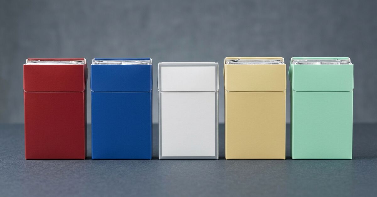
Short answer: cigarette pack colors are real packaging cues, but Canada does not have a universal red-blue-silver-green code. Tobacco companies have used color to make variants look and feel different. Darker or red packaging can suggest a fuller, stronger style, while lighter blue, silver, or white packaging can suggest a milder style. Green is often associated with menthol or freshness. Those are design conventions and shopper perceptions—not technical specifications.
This guide explains how to use color when browsing the BuyCigsOnline catalog without treating a color as a guarantee. The reliable reference is always the exact product title, followed by the brand family and the product page.
What cigarette pack colors can—and cannot—tell you
Color cue       What it may suggest              What to verify
Red or dark     Full, Original, fuller style     The exact variant name
Blue            Light, Lights, or Blue           Light, Ultra Blue, or Blue?
Silver/white    Lighter or distinct variant     Silver, Extra Lights, or Ultra Light?
Green           Menthol or freshness             Menthol in the product title
Gold            Premium or brand-specific cue    The brand's own naming system
The important word in that guide is may. A color does not identify a blend, nicotine level, or product strength on its own. Two brands can use the same color for different variants, and one brand can use a color as part of a name without using it as a strength ladder.
Why the color associations exist
Packaging research has repeatedly found that color changes what people expect from the product inside. In Canadian consumer research, lighter colors and names such as Silver or Smooth were more likely to be judged as milder or smoother than darker colors and Full Flavor-style names. That finding supports the idea that color is a marketing cue. It does not support using color as a universal shopping rule.
In other words, the color pattern is not made up—but it is also not a secret Canadian specification. It is a set of visual shortcuts created by brand design and learned by shoppers over time. The same shortcut becomes unreliable as soon as you switch brands.
Use the written variant name first
The BCO catalog is easier to compare when you start with the words on the listing rather than the pack image. A few families show why:
- Canadian Cigarettes: Full, Lights, Ultra Lights, and Menthol.
- Classics: Full Flavor, Lights, Extra Lights, and Menthol.
- Playfare: Full Flavor, Light, Ultra Light, and Menthol.
Within one family, a pack image can help you recognize a product you already know. The written names make the comparison precise. If you normally choose a Light product, begin with another listing that actually says Light or Lights. Do not assume that every blue or pale pack is interchangeable.
Where the color shortcut breaks down
- Time Blue Cigarettes uses Blue as its written variant name. Blue is not automatically the same thing as Light in every brand.
- Canadian Classics Silver and Canadian Classics Ultra Blue are separate listings. A color word in one product name does not define the whole lineup.
- dM Original and dM Smooth use descriptive names instead of a simple color ladder.
- Canadian Premium Original and Canadian Premium Special show why gold, white, or silver imagery should not be translated into a fixed category without reading the listing.
How to choose the right variant
- Match the exact name. Start with Full Flavor, Full, Original, Light, Lights, Ultra Light, Silver, Smooth, Special, Blue, or Menthol.
- Compare within the same brand family. A two-, three-, or four-variant lineup gives you a better reference point than a single pack image.
- Use color only as a recognition cue. It can help you spot a familiar product, but it should not make the decision for you.
- Open the product page before ordering. Confirm the brand, variant, format, and available pack or carton quantity.
If you are moving from one brand to another, the switching cigarette brands guide is a better starting point than trying to match a color from memory. For a full side-by-side browse, use the BCO cigarettes category and filter your search by the written variant name.
FAQ about cigarette pack colors in Canada
Does red always mean Full Flavor?
No. Red or darker packaging is often used to suggest a fuller or standard style, but it is not a universal code. Confirm the product title and compare it with the other variants in the same family.
Does blue always mean Light?
No. Blue may appear with Light, Lights, Ultra Blue, or a brand-specific Blue name. Choose a listing that says Light or Lights when that is the variant you want.
Does green always mean Menthol?
Green is commonly associated with menthol or freshness, but check the written title. The word Menthol on the product page is the confirmation; the color is only a visual cue.
Bottom line: color is a shortcut, not the specification
Cigarette pack colors in Canada can help shoppers recognize a familiar brand family, and the broad red/full, blue-or-silver/lighter, and green/menthol associations have a real history in tobacco packaging design. But those associations are not universal, and they do not replace the product name.
Identify the brand, match the written variant, open the product page, and then choose the quantity you want. Browse the cigarettes category to compare the catalog or go straight to the BCO shop when you already know the exact product.